Web Design & Branding
KVHKosher
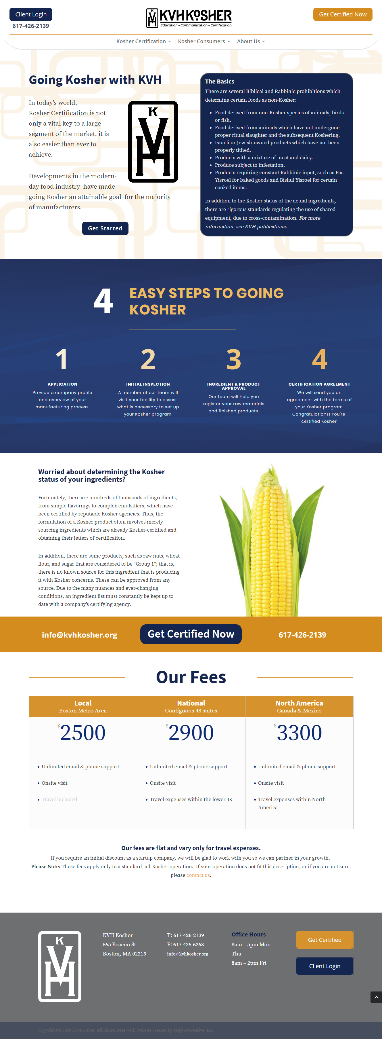
In the fall of 2019 KVHKosher decided it was time for a branding change. When I found the font “Epitaph” everything suddenly clicked. The font plus their kosher symbol mades a bold statement that has both a modern and traditional feel.
I was then tasked with updating the KVHKosher website. They chose a traditional blue and grey color palette, so I punched up the website with saturated, bold backgrounds and lots of orange accents.
Design focused on the pages that would bring in certification customers, but a strong secondary purpose–providing information and education to consumers–meant focused work on those pages as well.
Categories
Web Design
Branding


